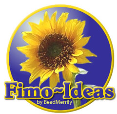
Wantec to brand up my fimo ideas blog a bit better before i go for it, so had Meg do me a logo. She’s come up with this, which i really like. What do you think?
I really wanted something different and more personal to me so i don’t get sick of the whole beadmerrily brand-y thing. Even though this site will support BM, i’d like it to have it’s own identity too.


I like the sunflower!
Don’t like the tilda/hyphen between Fimo and Ideas at all. That would annoy me every time I saw it.
And sunflowers are pretty (and I know you like them, which is a good enough reason to keep it) but they don’t make me think of modelling clay, lol!
Grin… the dash (which is what it needs to be) made it look like a tabletop 😆
By the time i’ve made a few more sunflowers.. the WORLD will think of fimo when they see them 😉
Very bright and cheerful. 🙂
Not overly keen on the hyphen either though but can’t explain why.
They don’t. I just like sunflowers and this isn’t so much a business as an merry entertainment site 😉
I’m going to have to change the wiggle now; it has started to make it look like it says Fi Mould Ears.
I should just shut up and not suggest things to Meg really 🙂
I don’t really get what sunflowers have to do with modelling clay. I know I’m slow…
Oh gosh, now it feels like spread!
Right. Then it looks great. Makes me think of nourishing food. I’m hungry now 😐
sunflowers are fine but make a fimo one as the logo and then it all ties in?
Hmm, I did sort of think it felt a bit like logo for sunflower margarine even before I read the comments (Fimo on your toast?). Very good logo, but doesn’t at all say anything remotely Fimo-ish to me